RoundGlass
Role:
Team:
2 - 3 designers, 1 PM, 20 ~ engineers
Scope:
Brief:
Senior Product Designer
Mobile, onboarding, home screen
Onboarding, post-launch updates
High level overviews of Liam and Kylie, our mindfulness oriented personas. Liam is meditation specific whereas Kylie has a broad interest in all areas of the wellness categories.
The overarching user journey for our MVP was pretty straightforward.
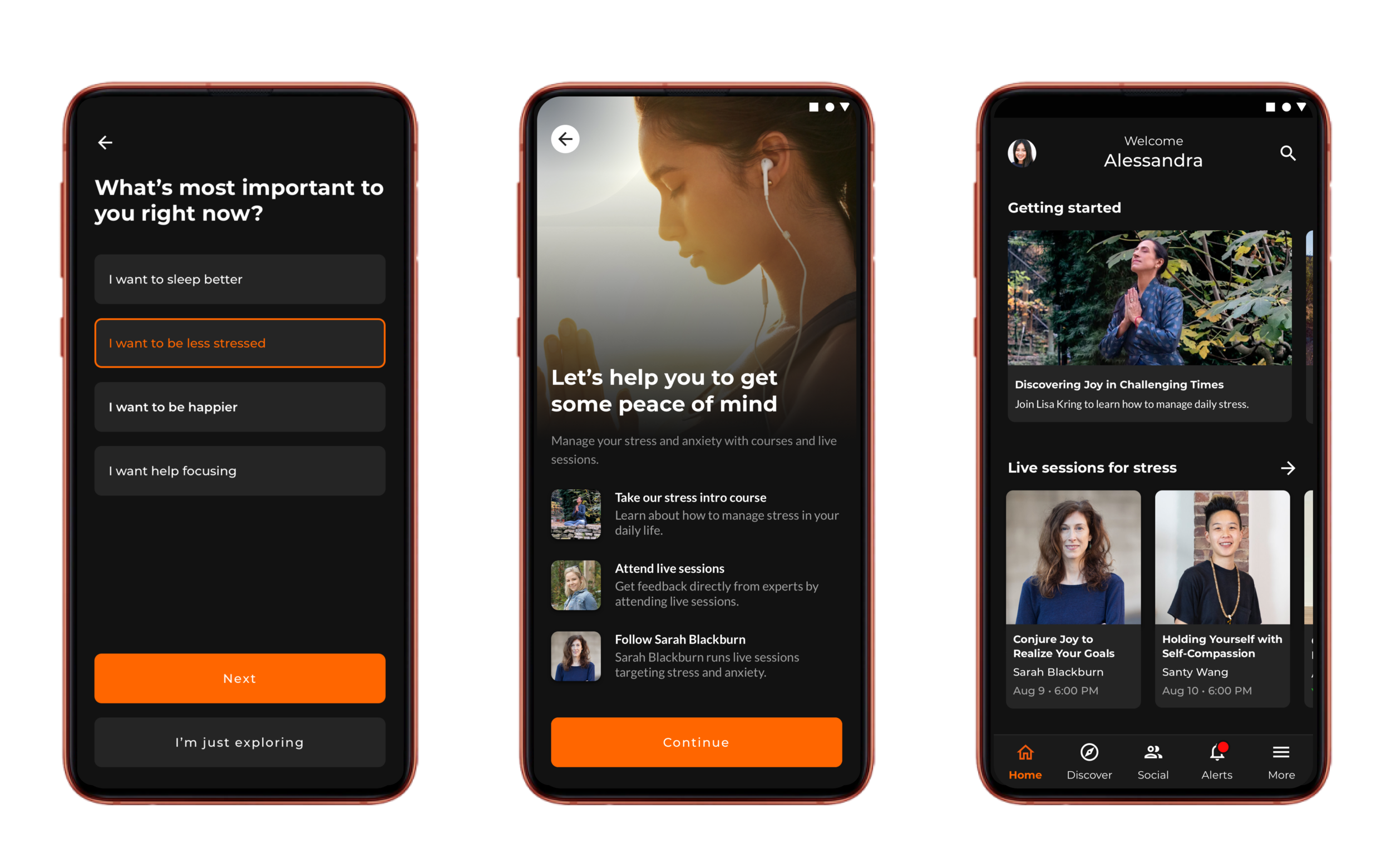
As part of onboarding, we would ask the user to indicate what topic was most important to them, and we would recommend them content to engage with. We tracked which teachers and topics they liked and would make content recommendations to the users based on this.
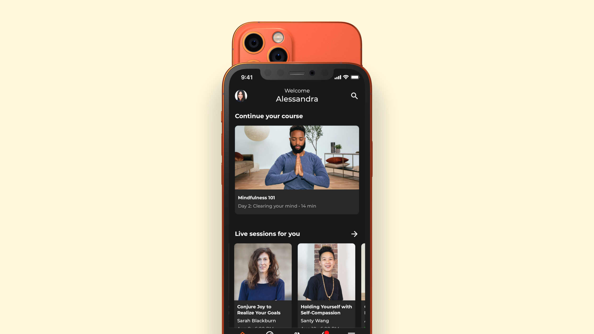
- The home screen in particular utilized several different types of interactions to browse and engage with content. Some had explicit CTAs, others you had to swipe left and right to view more, and the articles section was an infinite scroll. I felt this complexity was not necessary, and changed this so that the majority of content is swipable left/right to view more. This brought the app more in line with other popular design patterns used by Netflix, Apple, etc. Most importantly, this interaction was implemented across the board, so the user only had to learn one pattern.
- The app had utilized aggressive margins, padding, and font sizes. We often could not fit the content we needed to in the space provided. I tightened up our margins and adjusted our fonts to make it so that our design would be more flexible.
- All caps was over-leveraged. All-caps are harder to read, and so I used sentence casing for most cases.
Loop Team >
© Tom Bergman 2025
All Rights Reserved

RoundGlass
Role:
Team:
2 - 3 designers, 1 PM, 20 ~ engineers
Senior Product Designer
Native mobile, onboarding, home screen
Scope:
Brief:
Initial onboarding and post-launch updates
High level overviews of Liam and Kylie, our mindfulness oriented personas. Liam is meditation specific whereas Kylie has a broad interest in all areas of the wellness categories.

The overarching user journey for our MVP was pretty straightforward.
As part of onboarding, we would ask the user to indicate what topic was most important to them, and we would recommend them content to engage with. We tracked which teachers and topics they liked and would make content recommendations to the users based on this.
- The home screen in particular utilized several different types of interactions to browse and engage with content. Some had explicit CTAs, others you had to swipe left and right to view more, and the articles section was an infinite scroll. I felt this complexity was not necessary, and changed this so that the majority of content is swipable left/right to view more. This brought the app more in line with other popular design patterns used by Netflix, Apple, etc. Most importantly, this interaction was implemented across the board, so the user only had to learn one pattern.
- The app had utilized aggressive margins, padding, and font sizes. We often could not fit the content we needed to in the space provided. I tightened up our margins and adjusted our fonts to make it so that our design would be more flexible.
- All caps was over-leveraged. All-caps are harder to read, and so I used sentence casing for most cases.
Loop Team >
© Tom Bergman 2025 All Rights Reserved
RoundGlass
Role:
Team:
Senior Product Designer
2 - 3 designers, 1 PM, 20 ~ engineers
Scope:
Native mobile, onboarding, home screen
Brief:
Initial onboarding and post-launch updates

High level overviews of Liam and Kylie, our mindfulness oriented personas. Liam is meditation specific whereas Kylie has a broad interest in all areas of the wellness categories.
The overarching user journey for our MVP was pretty straightforward.
As part of onboarding, we would ask the user to indicate what topic was most important to them, and we would recommend them content to engage with. We tracked which teachers and topics they liked and would make content recommendations to the users based on this.
- The home screen in particular utilized several different types of interactions to browse and engage with content. Some had explicit CTAs, others you had to swipe left and right to view more, and the articles section was an infinite scroll. I felt this complexity was not necessary, and changed this so that the majority of content is swipable left/right to view more. This brought the app more in line with other popular design patterns used by Netflix, Apple, etc. Most importantly, this interaction was implemented across the board, so the user only had to learn one pattern.
- The app had utilized aggressive margins, padding, and font sizes. We often could not fit the content we needed to in the space provided. I tightened up our margins and adjusted our fonts to make it so that our design would be more flexible.
- All caps was over-leveraged. All-caps are harder to read, and so I used sentence casing for most cases.
© Tom Bergman 2025 All Rights Reserved