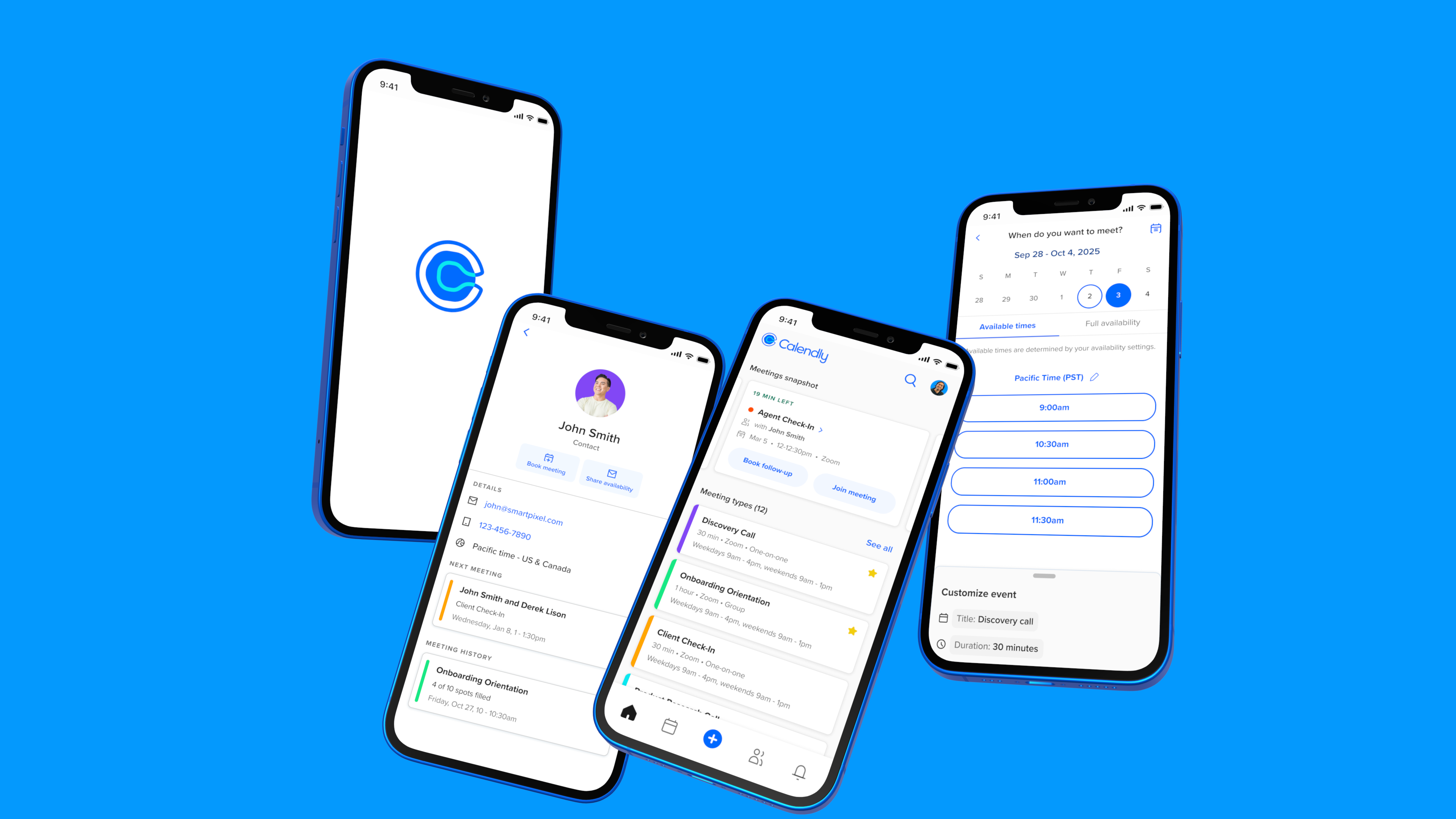
Calendly Mobile
Role:
Senior Product Designer
Scope:
Native mobile, design system
Brief:
End-to-end app redesign
Team:
1 designer, 1 PM, 10 engineers
Upon starting work on the mobile apps, I saw that the visual design didn’t align with the Calendly brand and lacked internal consistency. Key elements, like event types, were cluttered with CTAs and varied fonts, complicating user interpretation and decision-making. These were surface issues, however; to enhance the experience, I needed to study how users were engaging with the app.
Key Observations
As I dug into our analytics and interviewed our users, I learned that people using the mobile app engaged with Calendly differently than those who primarily used the web experience. Mobile users spent significant time in the scheduled events section, despite a lack of compelling features. Many hosts were also using their own booking pages for scheduling, which was surprising given Calendly's link-sharing focus.
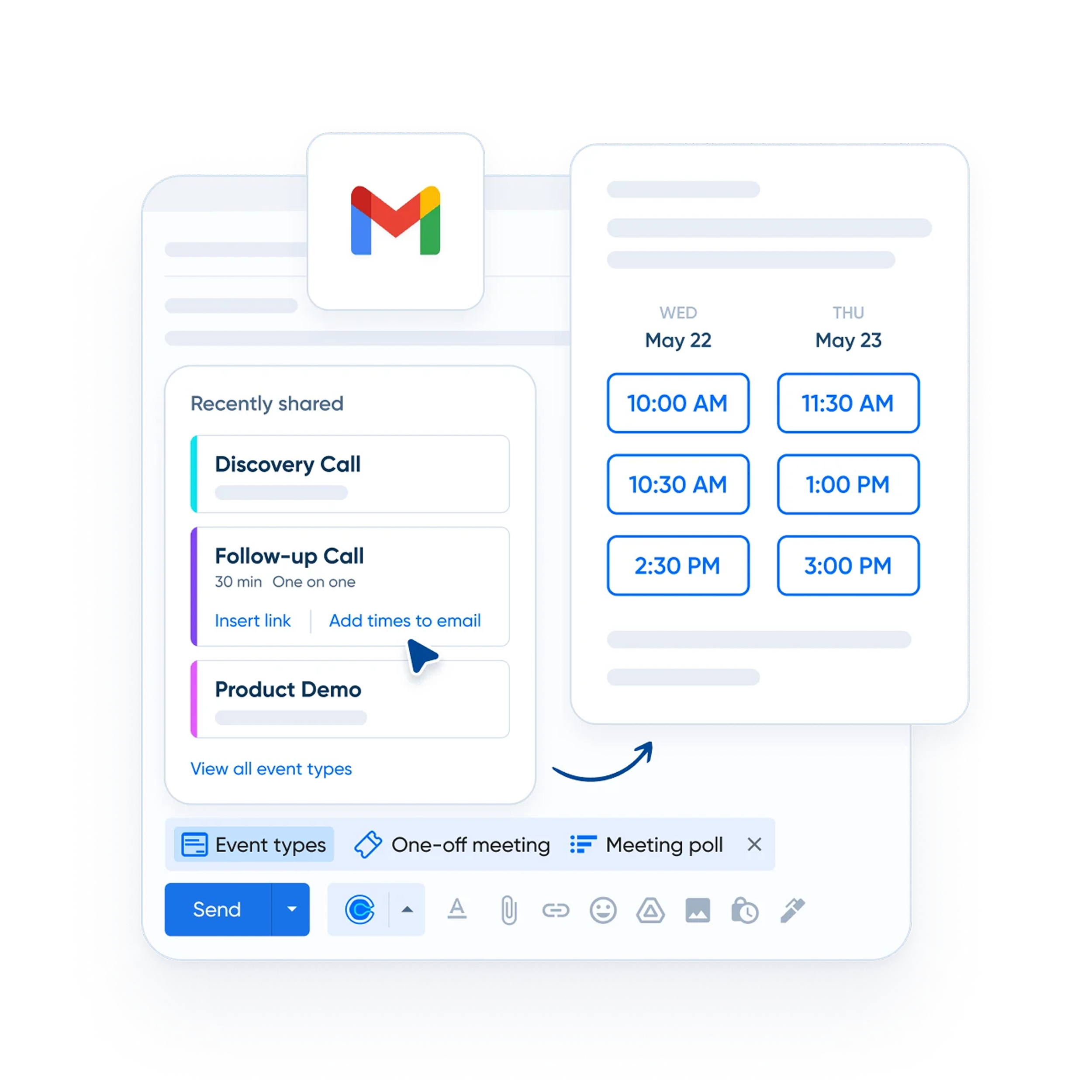
Example of a host booking a meeting through the booking page preview.
Users were reaching their booking page in the app using an unusual method. They accessed it through a preview feature, so it was essentially a hack. But what really got our team’s attention was how often users were doing this: 1 in 5 Calendly meetings were being booked this way.
Interviews and survey results
We decided to survey users to get further clarity on what was going well but also what we needed to improve upon.
“I can schedule follow-ups on the spot so I don't have to worry about forgetting.”

Account Executive (Sales)
"The app makes it easy for me to quickly look at what I have coming up and know when I'm going to be available."

Account Executive (Sales)
"I'm very happy with how fast (scheduling a new meeting) can be done."

Recruiter
58% of users agreed that the mobile app helps them to manage meetings in real-time. Users mentioned two different use cases:
- Users said booking a follow up meeting while in the meeting makes a good impression on invitees and keeps them from forgetting to share/book afterwards. Users who shared links in the meeting spoke of similar benefits.
- Users also mentioned using the app to check and manage their schedules. Users wanted to know what was coming next and to be able to quickly modify their schedules if a meeting was running over.
- While there were no mentions of screen sharing specifically (ie. screen sharing a host’s availability to an invitee), there was a sense that it was quicker and less disruptive to use the app while in a meeting.
"It's confusing that certain things can only be found in certain tabs."

Customer Support Specialist
"The app is just not as user friendly."

Recruiter
"It is difficult to access a past scheduled contact's information on the mobile app."

Account Executive (Sales)
Users cited difficulties navigating the app and locating certain features (esp. availability). Some users found the process of updating global availability in the app cumbersome. They expressed frustrations around getting redirected to mobile web to complete certain tasks (some users found mobile web sluggish and outdated).
Key goals
Design a new experience that better meets the Calendly mobile user’s unique needs (managing events).
Create a system where Calendly users engage with the app on a daily basis.
Key metrics
Increase engagement and feature adoption.Increase in DAU and WAU.
Increase revenue.
Scheduled events view
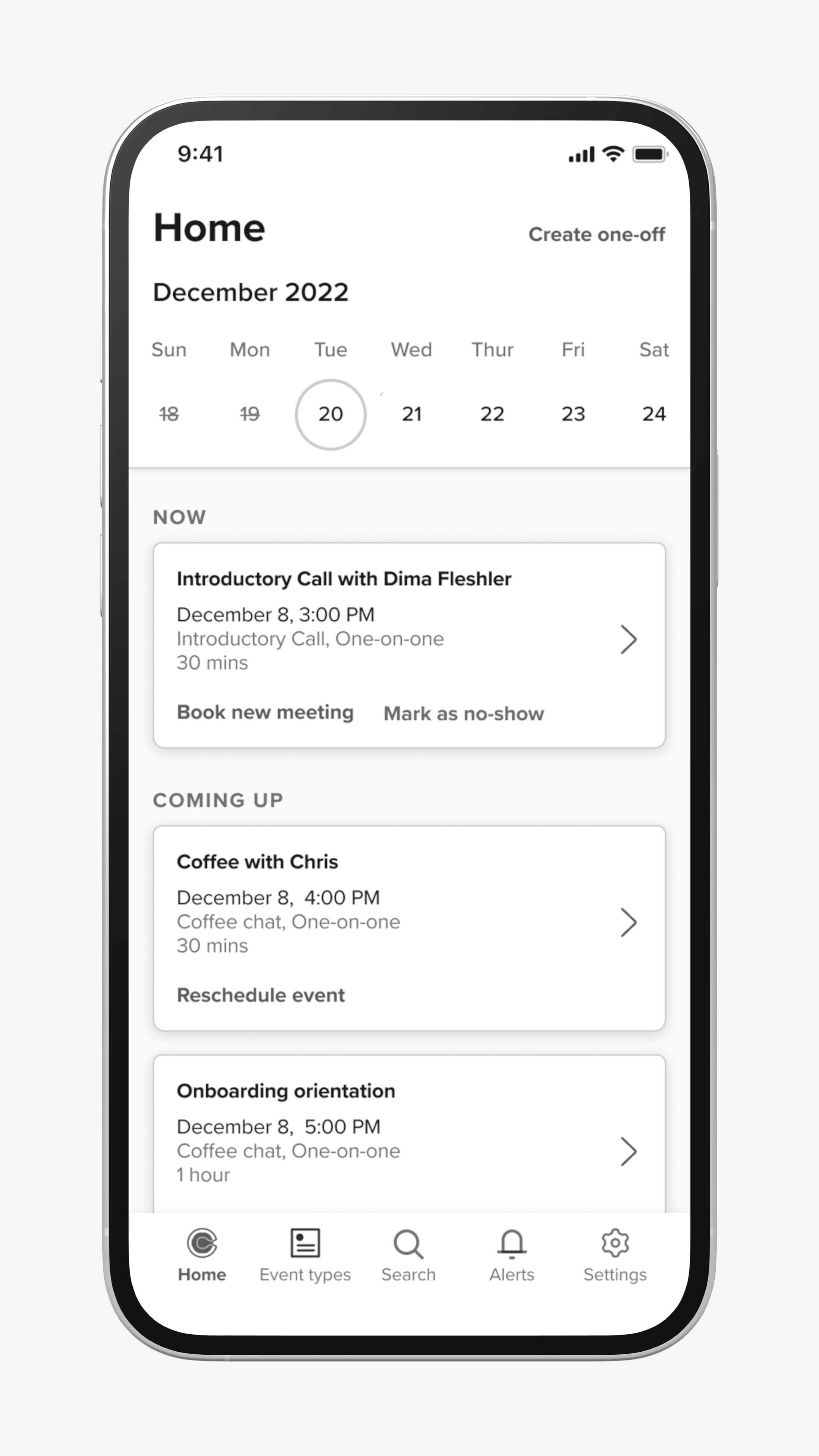
A low engineering effort that was proposed by leadership was to simply make our scheduled events screen the app’s landing page and add contextual actions to the events.
While it was low cost, it buried event types and was not very valuable if the user had few or no events scheduled on a given day. For these reasons, I never saw this as a viable option.
Focus view
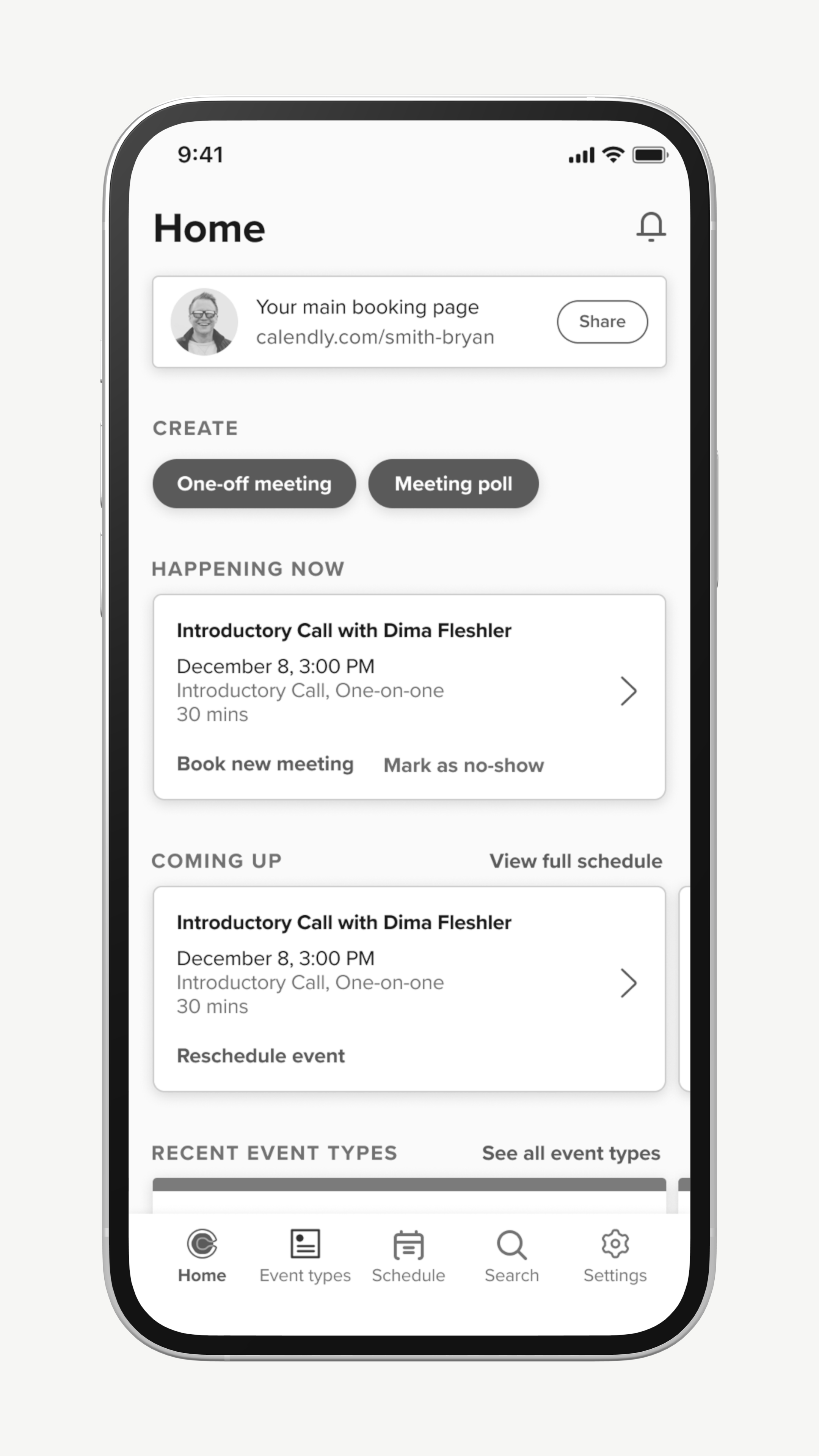
This exploration explored a home screen concept that was more dynamic. It placed greater focus on events and de-emphasized event types. A user could still access dedicated views for event types and scheduled events if they needed.
While there were elements of this I liked, the visual hierarchy felt too complex and I believed I could find a simpler solution.
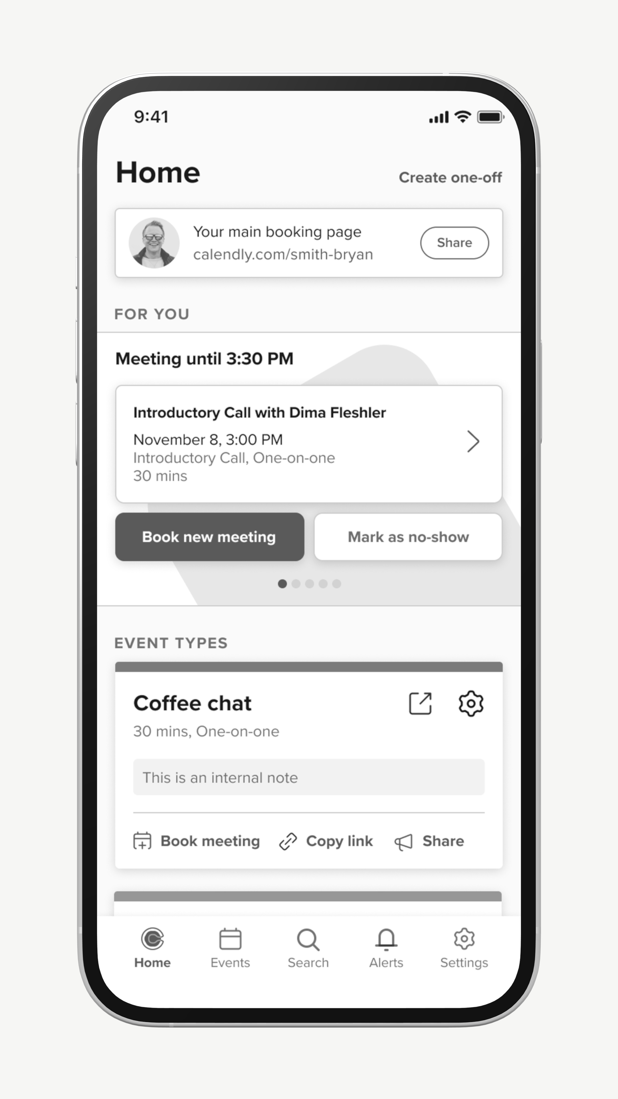
Split view
The split view had a ‘for you’ carousel at the top which largely showed meetings to users in order of priority. A users could scroll down further to view their event types.
This exploration is pretty close to where I ultimately landed. However, I still felt the visual hierarchy was too complex and event types were still very complex objects.
Prototyping with Users
After refining my designs further, I created a prototype in Figma that combined elements of the above explorations into one, as well as a new method for navigating through the app. I tested this prototype with about 40 different users and the results were very positive.
Some of the specific elements I was testing were...
New navigation model
To try to improve the app’s navigation, I introduced a home screen with three tabs: Activity, Event Types and Availability. The user could swipe between these tabs.
Although users responded positively to this navigation style, I ultimately did not take this into future revisions. Only half of the users naturally discovered that they could swipe between the tabs. I didn’t think it was intuitive enough and was not comfortable relying on it.
Activity tab
A new concept I introduced in this prototype was something I labeled ‘Activity.’ Activity was focused on showcasing meetings for a user that were happening now, coming up, or recently completed. Meetings were paired with CTAs that changed depending on the stage of the meeting lifecycle.
This performed very well in testing, and users quickly adopted this as their primary way of engaging with their meetings.
Event types simplification
I removed all the CTAs from the surface of the event type cards. Going forward, a user would interact with an event type by tapping the object and selecting the action they wanted to take from an action sheet.
Users reported in testing that the interaction felt ‘faster’ than what was existing in-app at the time, even though it in fact required more taps. I suspect the ‘speed’ users perceived was due to simplified visuals making the screen easier to parse, which helped decision-making.
Meeting Snapshot and Improved Booking Flows
Meeting Snapshot (previously ‘Activity’) became the centerpiece of the home screen. Users can swipe right and left to see meetings that are happening now, upcoming, or have recently occurred.
As part of this, managing meetings is handled entirely in-app. Hosts no longer need to use mobile web to schedule their next meeting and receive additional functionality when booking in-app.
Meeting Types Simplification
Meeting types (formerly Event Types) were simplified drastically with all interactions moving into an action sheet. We moved to a model where by default, only 5 meeting types appear on the home screen, but if the user wants to see more, they can navigate into a dedicated meeting types screen. We chose this number because very few users had more than five meeting types that they engaged with frequently.
We also introduced favoriting to make it so users had a manual way to control what meeting types appeared on their home screen.
Improved Drill-downs and Deep Linking
Users had frequently complained about having to navigate into one section of the app to find information (such as a contact’s email address) only to navigate into a completely new area to use that information to complete a work flow (such as booking a new meeting).
As part of this redesign, we started deep linking more often to other objects to make sure that users could stay in flow and take actions where it made the most sense.
RoundGlass >
© Tom Bergman 2025
All Rights Reserved

Calendly Mobile
Role:
1 designer, 1 PM, 10 engineers
Senior Product Designer
Scope:
Native mobile, design system
Team:
Brief:
End-to-end app redesign

Upon starting work on the mobile apps, I saw that the visual design didn’t align with the Calendly brand and lacked internal consistency. Key elements, like event types, were cluttered with CTAs and varied fonts, complicating user interpretation and decision-making. These were surface issues, however; to enhance the experience, I needed to study how users were engaging with the app.
Key Observations
As I dug into our analytics and interviewed our users, I learned that people using the mobile app engaged with Calendly differently than those who primarily used the web experience. Mobile users spent significant time in the scheduled events section, despite a lack of compelling features. Many hosts were also using their own booking pages for scheduling, which was surprising given Calendly's link-sharing focus.
Example of a host booking a meeting through the booking page preview.
Users were reaching their booking page in the app using an unusual method. They accessed it through a preview feature, so it was essentially a hack. But what really got our team’s attention was how often users were doing this: 1 in 5 Calendly meetings were being booked this way.
Interviews and survey results
We decided to survey users to get further clarity on what was going well but also what we needed to improve upon.
“I can schedule follow-ups on the spot so I don't have to worry about forgetting.”

Account Executive (Sales)
"The app makes it easy for me to quickly look at what I have coming up and know when I'm going to be available."

Account Executive (Sales)
"I'm very happy with how fast (scheduling a new meeting) can be done."

Recruiter
58% of users agreed that the mobile app helps them to manage meetings in real-time. Users mentioned two different use cases:
- Users said booking a follow up meeting while in the meeting makes a good impression on invitees and keeps them from forgetting to share/book afterwards. Users who shared links in the meeting spoke of similar benefits.
- Users also mentioned using the app to check and manage their schedules. Users wanted to know what was coming next and to be able to quickly modify their schedules if a meeting was running over.
- While there were no mentions of screen sharing specifically (ie. screen sharing a host’s availability to an invitee), there was a sense that it was quicker and less disruptive to use the app while in a meeting.
"It's confusing that certain things can only be found in certain tabs."

Customer Support Specialist
"The app is just not as user friendly."

Recruiter
"It is difficult to access a past scheduled contact's information on the mobile app."

Account Executive (Sales)
Users cited difficulties navigating the app and locating certain features (esp. availability). Some users found the process of updating global availability in the app cumbersome. They expressed frustrations around getting redirected to mobile web to complete certain tasks (some users found mobile web sluggish and outdated).
Key goals
Design a new experience that better meets the Calendly mobile user’s unique needs (managing events).
Create a system where Calendly users engage with the app on a daily basis.
Key metrics
Increase engagement and feature adoption.Increase in DAU and WAU.
Increase revenue.

Scheduled events view
A low engineering effort that was proposed by leadership was to simply make our scheduled events screen the app’s landing page and add contextual actions to the events.
While it was low cost, it buried event types and was not very valuable if the user had few or no events scheduled on a given day. For these reasons, I never saw this as a viable option.

Focus view
This exploration explored a home screen concept that was more dynamic. It placed greater focus on events and de-emphasized event types. A user could still access dedicated views for event types and scheduled events if they needed.
While there were elements of this I liked, the visual hierarchy felt too complex and I believed I could find a simpler solution.

Split view
The split view had a ‘for you’ carousel at the top which largely showed meetings to users in order of priority. A users could scroll down further to view their event types.
This exploration is pretty close to where I ultimately landed. However, I still felt the visual hierarchy was too complex and event types were still very complex objects.
Prototyping with Users
After refining my designs further, I created a prototype in Figma that combined elements of the above explorations into one, as well as a new method for navigating through the app. I tested this prototype with about 40 different users and the results were very positive.
Some of the specific elements I was testing were...
Meeting Snapshot and Improved Booking Flows
Meeting Snapshot (previously ‘Activity’) became the centerpiece of the home screen. Users can swipe right and left to see meetings that are happening now, upcoming, or have recently occurred.
As part of this, managing meetings is handled entirely in-app. Hosts no longer need to use mobile web to schedule their next meeting and receive additional functionality when booking in-app.
Meeting Types Simplification
Meeting types (formerly Event Types) were simplified drastically with all interactions moving into an action sheet. We moved to a model where by default, only 5 meeting types appear on the home screen, but if the user wants to see more, they can navigate into a dedicated meeting types screen. We chose this number because very few users had more than five meeting types that they engaged with frequently.
We also introduced favoriting to make it so users had a manual way to control what meeting types appeared on their home screen.
Improved Drill-downs and Deep Linking
Users had frequently complained about having to navigate into one section of the app to find information (such as a contact’s email address) only to navigate into a completely new area to use that information to complete a work flow (such as booking a new meeting).
As part of this redesign, we started deep linking more often to other objects to make sure that users could stay in flow and take actions where it made the most sense.
Project Results
I had high expectations for this project, in large part due to the strength of the user research that backed up my design decisions. We saw a 25% increase in traffic for scheduled events as well as stronger retention and daily app usage.
Those increases were expected given the scope of the work, but I have been even more proud of how Calendly Mobile compares to Calendly web now:
- The mobile app has stronger 4 week retention compared to web.
- Customers are more likely to convert into paying customers if they use the mobile app.
- Mobile users have higher engagement (DAU/WAU).
- Mobile-dominant users have significantly greater activation rates.
This is a great turnaround from where we originally started and for that reason I consider this some of my best work.
RoundGlass >
© Tom Bergman 2025 All Rights Reserved
Calendly Mobile
Role:
Team:
Senior Product Designer
1 designer, 1 PM, 10 engineers
Scope:
Native mobile, design system
Brief:
End-to-end app redesign


Upon starting work on the mobile apps, I saw that the visual design didn’t align with the Calendly brand and lacked internal consistency. Key elements, like event types, were cluttered with CTAs and varied fonts, complicating user interpretation and decision-making. These were surface issues, however; to enhance the experience, I needed to study how users were engaging with the app.
Key Observations
As I dug into our analytics and interviewed our users, I learned that people using the mobile app engaged with Calendly differently than those who primarily used the web experience. Mobile users spent significant time in the scheduled events section, despite a lack of compelling features. Many hosts were also using their own booking pages for scheduling, which was surprising given Calendly's link-sharing focus.
Example of a host booking a meeting through the booking page preview.
Users were reaching their booking page in the app using an unusual method. They accessed it through a preview feature, so it was essentially a hack. But what really got our team’s attention was how often users were doing this: 1 in 5 Calendly meetings were being booked this way.
Interviews and survey results
We decided to survey users to get further clarity on what was going well but also what we needed to improve upon.
“I can schedule follow-ups on the spot so I don't have to worry about forgetting.”

Account Executive (Sales)
"The app makes it easy for me to quickly look at what I have coming up and know when I'm going to be available."

Account Executive (Sales)
"I'm very happy with how fast (scheduling a new meeting) can be done."

Recruiter
58% of users agreed that the mobile app helps them to manage meetings in real-time. Users mentioned two different use cases:
- Users said booking a follow up meeting while in the meeting makes a good impression on invitees and keeps them from forgetting to share/book afterwards. Users who shared links in the meeting spoke of similar benefits.
- Users also mentioned using the app to check and manage their schedules. Users wanted to know what was coming next and to be able to quickly modify their schedules if a meeting was running over.
- While there were no mentions of screen sharing specifically (ie. screen sharing a host’s availability to an invitee), there was a sense that it was quicker and less disruptive to use the app while in a meeting.
"It's confusing that certain things can only be found in certain tabs."

Customer Support Specialist
"The app is just not as user friendly."

Recruiter
"It is difficult to access a past scheduled contact's information on the mobile app."

Account Executive (Sales)
Users cited difficulties navigating the app and locating certain features (esp. availability). Some users found the process of updating global availability in the app cumbersome. They expressed frustrations around getting redirected to mobile web to complete certain tasks (some users found mobile web sluggish and outdated).
Key goals
Design a new experience that better meets the Calendly mobile user’s unique needs (managing events).
Create a system where Calendly users engage with the app on a daily basis.
Key metrics
Increase engagement and feature adoption.Increase in DAU and WAU.
Increase revenue.

Scheduled events view
A low engineering effort that was proposed by leadership was to simply make our scheduled events screen the app’s landing page and add contextual actions to the events.
While it was low cost, it buried event types and was not very valuable if the user had few or no events scheduled on a given day. For these reasons, I never saw this as a viable option.

Focus view
This exploration explored a home screen concept that was more dynamic. It placed greater focus on events and de-emphasized event types. A user could still access dedicated views for event types and scheduled events if they needed.
While there were elements of this I liked, the visual hierarchy felt too complex and I believed I could find a simpler solution.

Split view
The split view had a ‘for you’ carousel at the top which largely showed meetings to users in order of priority. A users could scroll down further to view their event types.
This exploration is pretty close to where I ultimately landed. However, I still felt the visual hierarchy was too complex and event types were still very complex objects.
Prototyping with Users
After refining my designs further, I created a prototype in Figma that combined elements of the above explorations into one, as well as a new method for navigating through the app. I tested this prototype with about 40 different users and the results were very positive.
Some of the specific elements I was testing were...
New navigation model
To try to improve the app’s navigation, I introduced a home screen with three tabs: Activity, Event Types and Availability. The user could swipe between these tabs.
Although users responded positively to this navigation style, I ultimately did not take this into future revisions. Only half of the users naturally discovered that they could swipe between the tabs. I didn’t think it was intuitive enough and was not comfortable relying on it.
Activity tab
A new concept I introduced in this prototype was something I labeled ‘Activity.’ Activity was focused on showcasing meetings for a user that were happening now, coming up, or recently completed. Meetings were paired with CTAs that changed depending on the stage of the meeting lifecycle.
This performed very well in testing, and users quickly adopted this as their primary way of engaging with their meetings.
Event types simplification
I removed all the CTAs from the surface of the event type cards. Going forward, a user would interact with an event type by tapping the object and selecting the action they wanted to take from an action sheet.
Users reported in testing that the interaction felt ‘faster’ than what was existing in-app at the time, even though it in fact required more taps. I suspect the ‘speed’ users perceived was due to simplified visuals making the screen easier to parse, which helped decision-making.
Meeting Snapshot and Improved Booking Flows
Meeting Snapshot (previously ‘Activity’) became the centerpiece of the home screen. Users can swipe right and left to see meetings that are happening now, upcoming, or have recently occurred.
As part of this, managing meetings is handled entirely in-app. Hosts no longer need to use mobile web to schedule their next meeting and receive additional functionality when booking in-app.
Meeting Types Simplification
Meeting types (formerly Event Types) were simplified drastically with all interactions moving into an action sheet. We moved to a model where by default, only 5 meeting types appear on the home screen, but if the user wants to see more, they can navigate into a dedicated meeting types screen. We chose this number because very few users had more than five meeting types that they engaged with frequently.
We also introduced favoriting to make it so users had a manual way to control what meeting types appeared on their home screen.
Improved Drill-downs and Deep Linking
Users had frequently complained about having to navigate into one section of the app to find information (such as a contact’s email address) only to navigate into a completely new area to use that information to complete a work flow (such as booking a new meeting).
As part of this redesign, we started deep linking more often to other objects to make sure that users could stay in flow and take actions where it made the most sense.
© Tom Bergman 2025 All Rights Reserved